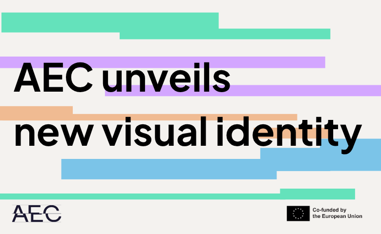
Visual identities are more than colours, fonts and shapes. At their best, they tell us something about who an organisation is, what it stands for and where it is going. They create recognition – a sense that, at a glance, you know where you are and who is speaking.
AEC has had a strong and recognisable logo for many years. But around that logo, our visual identity has gradually become less consistent. Those of you who regularly attend AEC events may have noticed that our different platforms and conferences have often developed their own colours, shapes and fonts, chosen to reflect the character and theme of each event. Our website and social media, meanwhile, have followed another visual standard.
There is nothing wrong with variety. In fact, it reflects something important about AEC: the richness and diversity of our community. But as AEC has grown in its activities, partnerships and public role, we felt that the time had come to create a stronger visual connection between all the different parts of our work.
So the development of a new visual identity became an opportunity to ask a bigger question: what should AEC look and feel like in 2026? At the AEC Office, we began by returning to the AEC Strategy 2030 and discussing how some of its core ideas could be translated into a visual language.
First, we wanted the identity to have a clear connection to music itself. Sound, rhythm and time are fundamental to the art form that connects our members, and these ideas have therefore become important elements in the new design.
Second, we wanted the identity to communicate credibility. AEC is not only a community of musicians and educators; it is also a European network active in policy discussions, advocacy and decision-making at the highest levels. Our visual expression should reflect both dimensions: artistic and creative, but also professional, confident and trustworthy.
And third, we wanted to preserve flexibility. AEC consists of many different activities, events and communities, each with its own character. The new identity therefore allows us to develop distinctive visual expressions for individual events and initiatives while ensuring that they remain clearly recognisable as part of AEC.
This balance between consistency and diversity feels particularly important for an organisation like ours. AEC brings together hundreds of institutions, thousands of teachers, students, leaders and professionals, and a wide range of artistic and educational traditions. We do not want everything to look the same. But we do want everything we do to feel connected.
Over the coming months, you will gradually see the new identity appearing across our website, publications, social media and events. Some things will look different. But the purpose behind them remains very familiar: to connect our community, strengthen Higher Music Education and make its voice heard across Europe and beyond.
A new visual identity will not change who AEC is.
But we hope it will help us express it more clearly.
A visual identity is the outward expression of what an organisation values and how it wishes to be understood. This refreshed identity honours the long and proud tradition of the higher music education sector while readying us for the years ahead, reflecting the confidence of an association that is strong in its advocacy, ambitious in its work, and supported by a network that grows richer year on year. I am delighted to support an identity that carries our history as a professional and service-oriented organisation forward and that looks, as we always do, to the future.
AEC needed an identity that could carry the weight of what it actually is: a network of over 300 member institutions, four main programmes and a voice that must hold up in front of the policymakers and partners who make its work possible. At that scale, building a recognisable identity isn't enough, we needed a system cohesive enough to hold the whole network together. We built a common visual language rooted in the musical staff, flexible enough to reflect that diversity yet accessible for the team to reuse endlessly across every event and platform. This came out of months of exchange with the AEC team, testing, adjusting, and rethinking until the system was ready for the team to compose with.
Discover the new logo!
We invite all AEC members and partners to download the new logo and use it on their websites and publications.